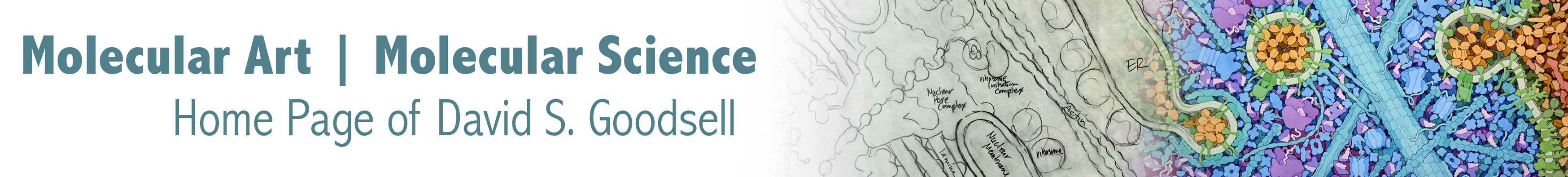
CellSpace: Talking about Colors
My approach to color is empirical, but with definite functional goals. As with all of my work, the major focus is to portray the science clearly and accurately, but adding artistic sensibility to make it appealing. I have developed my approach largely through intuitive experimentation with the media (watercolor and digital RGB), and have not (yet) taken advantage of the many excellent tools that are available for designing color schemes with particular aesthetic goals, such as visual separation of colors or schemes that address color blind viewers.
David S. Goodsell, September 2020
Functional Colors
The overall goal of my coloring scheme is to separate functionally-distinct portions of the scene. In the cellular landscapes, colors are typically used to separate functional regions, such as the inside, outside, and membranes of cells, organelles or viruses. In digital images of biomolecular assemblies, colors are used to distinguish subunits or domains with different or related functions.
I use a few overarching design parameters for this coloring scheme. First, I break the color wheel into several sectors, and use these to tell the broad strokes of the story, for example, separating DNA from proteins in an assembly or separating a cell from the surrounding environment. I typically use five of these sectors: blue-green to blue, shades of green, yellow/orange/red, magenta to purple, and earth tones.
Second, within each color sector, I try to choose values that visually integrate the entire collection of entities, while providing enough difference to distinguish the different entities. For example, I commonly push neighboring subunits in a complex to slightly bluer or slightly greener hues to highlight their arrangement or symmetry. In addition, I often use slightly desaturated colors to give some color texture, for example, coloring carbon atoms with a slightly desaturated hue of the subunit color.

In the painting of Zika virus attaching to a cell (left), the virus membrane is shown in reds and violets, the virus interior is in yellows and oranges, the cell membrane is in greens and the cell interior is in blues, and the surrounding blood plasma is in earth tones. Bright warm tones are used for the virus, since it is the focus of the image. In the images from the Molecule of the Month, colors are used to separate functional subunits. In the enhanceosome (center), many shades of blues/greens/purples are used for the many different proteins and red/orange are used for the two strands of the DNA double helix. Carbon atoms are slightly desaturated to give a small amount of additional color texture. In the papillomavirus images (right), two types of viral subunits are shown in red/orange, and antibodies are shown with the subunits in different shades of blue.
Watercolors
My approach to watercolor is built on a few simple principles, designed to provide luminous colors and a strong feeling of depth specifically for these scenes of a crowded cross section. I typically use Windsor Newton colors, except where noted below.
Foreground colors are mixtures of few colors to keep the luminosity of the original paints. The sectors described above are rendered using:
- Viridian hue and cobalt blue, my favorite range of blues for cellular cytoplasm. I have found viridian to be too grainy, and viridian hue gives more consistent results. I occasionally add ultramarine (green shade) when I want another blue, typically using it with no mixture with other colors.
- Viridian hue and cadmium yellow pale, for a range of greens for cellular membranes. I occasionally add a touch of yellow ochre if I want a slightly dirtier color.
- Cadmium yellow pale and windsor red, often with yellow ochre and burnt sienna, for nucleic acids and nucleic acid binding proteins. I build yellows, oranges and reds with cadmium yellow pale and windsor red. Often, these are too glaring for my taste, so I dirty them a bit to get a golden yellow using the cadmium and ochre, and an earthier red with addition of a bit of burnt sienna. Windsor red is truly a force of nature and only needs the tiniest dab!
- Permanent magenta and dioxazine violet, for specialty things like viruses. I only recently started experimenting with purples in my paintings, and often work with mixtures of these two, occasionally with a tiny bit of windsor red to make the magenta dangerously vibrant.
- Yellow ochre, burnt sienna, vandyke brown and viridian hue, for earth tones for extracellular molecules and infrastructure. The combinations of these are almost infinite, giving an appealing range of tans, rusts, and dirty greens. They are great for areas that need to be filled and be appealing, but not dominate the focus of the picture. I have had persistent troubles with yellow ochre causing bleeding between areas of color, and I’m currently using Holbein watercolor that doesn’t seem to have the problem.
Background molecules are progressively depth cued to black by adding ivory black to cool colors, and vandyke brown to warm colors. I typically also add additional amounts of the base color as well–this is not appropriate for strict depth cueing, but I have found that it’s necessary to make the colors recognizable when the values get very dark.

My current palette. Colors that I haven’t used in years are in parentheses or shown with question marks.